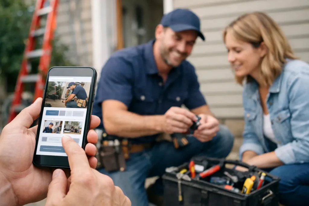
A bloke with a burst pipe or a dead power point is not sitting at a desktop comparing ten businesses. He is on his mobile, standing in a kitchen, driveway or worksite, trying to find someone who can answer the phone and get the job sorted. That is why a mobile-friendly business website matters so much for tradies and local service businesses. If your site is hard to read, slow to load, or awkward to use on a phone, you are losing work before the customer even calls.
For plumbers, sparkies, builders, landscapers and other service businesses, mobile traffic is usually the main traffic. People search quickly, scan quickly and make decisions quickly. Your website does not need to win design awards. It needs to make the next step obvious and easy.
What a mobile-friendly business website actually does
A mobile-friendly business website is built for the way people really use their phones. The text is readable without pinching and zooming. Buttons are easy to tap. Phone numbers work properly. Pages load fast. The layout fits the screen instead of fighting it.
That sounds basic, but plenty of tradie websites still get this wrong. They might look fine on a laptop, then become a headache on mobile. Tiny text, oversized banners, hard-to-find contact details, and enquiry forms that take too long to fill out are common problems. If a customer gets frustrated, they do not complain. They just go back to Google and ring the next business.
The point is simple. A website on mobile should help someone take action in seconds, not make them work for it.
Why mobile matters more for tradies
Most local service jobs start with urgency, convenience, or both. Someone needs a fence repaired, a leaking tap fixed, or a quote for paving. They are often searching while out and about, between jobs, at home on the couch, or right where the problem is. Mobile is not a secondary experience. For many businesses, it is the main one.
That changes how your website should be built. On desktop, a visitor might spend more time reading. On mobile, they are more likely to scan headings, check suburbs serviced, look at reviews, and hit call if they feel confident. If your site buries the phone number, opens slowly, or looks rough on a smaller screen, you are adding friction where you can least afford it.
There is also the Google side of it. Search engines care about mobile usability because users care about it. If your site performs poorly on mobile, that can hurt visibility as well as conversions. So the problem is not only that visitors drop off. You may also get fewer chances to be seen in the first place.
Signs your mobile website is costing you enquiries
A lot of business owners assume their website is fine because it exists and technically works. That is not the same as performing well.
If people visit but do not call, if enquiry forms get little use, or if bounce rates are high, mobile could be part of the issue. The same goes for sites with outdated layouts, long blocks of text, confusing menus, or homepage sliders that take forever to load. A good-looking site can still be poor at converting if it does not match how local customers behave.
Another common issue is weak trust signals above the fold. On mobile, the top section of the page needs to do heavy lifting fast. A clear service description, local area mention where relevant, strong call button, and some proof that you are legitimate all help. If the first screen says very little or wastes space on fluff, you are making the customer think too hard.
What customers need to see first on mobile
When someone lands on your site from a mobile search, they are usually trying to answer a few questions quickly. Do you do the job they need? Do you service their area? Can they contact you right now? Do you look trustworthy enough to call?
That means your mobile homepage and service pages should get to the point. Say what you do, who you help, and what the next step is. Keep the phone number easy to tap. Make your contact button visible without hunting for it. If you offer emergency work, same-day service, free quotes or fast response, say so clearly.
Photos still matter, but they should support the message, not get in the way of it. Too many oversized images can slow the page and push useful information down. On mobile, clarity beats cleverness every time.
The best mobile-friendly business website is built for action
This is where a lot of websites fall short. They explain the business, but they do not guide the customer towards contacting you. For a tradie business, every key page should support a simple action – call, request a quote, or send an enquiry.
That does not mean every page needs to be aggressive. It just means the path should be obvious. If someone is on a roofing page, they should not have to scroll to the bottom to work out how to reach you. If they are checking your service area, they should be able to confirm you cover their suburb and get in touch straight away.
A mobile site also needs restraint. Too many pop-ups, too many form fields, and too many distractions can kill conversions. There is a trade-off here. You might want lots of information from an enquiry form, but on mobile, shorter forms often get more responses. It is usually better to collect the basics and follow up than lose the lead completely.
Speed matters more than most businesses realise
People are impatient on mobile, especially when they need help quickly. If your site drags, they will not wait around out of politeness. They will leave.
Slow speed often comes from bloated images, clunky page builders, too many moving parts, or old websites that were never properly cleaned up. You do not need to understand the technical side to understand the business impact. A faster website gives more people a chance to stay, read, and contact you.
There is a balance, of course. You still want the site to look professional and reflect the quality of your work. But if fancy effects make the site slower and harder to use, they are not helping. For local service businesses, practical performance usually wins.
Mobile design and local trust go together
A customer judging your business on mobile is making a fast call about trust. They are looking for signs that you are real, local, and reliable. This is where the website, your Google presence, and your reviews all work together.
Your mobile site should make it easy to show suburbs you service, the types of jobs you take on, and the quality of your work. Testimonials and review snippets can help, as long as they are easy to read. So can clear wording about response times, licences where relevant, and what happens when someone contacts you.
For businesses across Perth and the Perth Hills, local relevance matters. A customer in Midland or Mundaring wants to know you actually work in their area. If that information is easy to find on mobile, it removes doubt and helps turn a search into an enquiry.
If your website is old, this is usually where it shows first
Desktop can hide problems. Mobile exposes them fast.
An older site might still function, but if it feels clunky on a phone, the damage is already being done. Menus become fiddly, pages stack badly, buttons sit too close together, and forms become painful. These are not small design issues. They directly affect how many leads your website produces.
If you have not checked your own site on a phone lately, do it properly. Open it as if you were a customer. Try to find a service, confirm your area, and make contact in under a minute. If anything feels annoying, unclear or slow, that is the same experience your customers are getting.
A better mobile site does not just make things look neater. It helps you convert more of the traffic you are already getting. That is often the quickest win.
A good mobile website should make the phone ring
For tradies, the job of a website is straightforward. It should help the right people find you, trust you, and contact you without messing around. A mobile-friendly business website does that better because it matches how real customers search and choose.
If your website is not doing that, it is not just a design problem. It is a lead flow problem. And unlike a lot of marketing talk, this one is easy to judge. If the site works well on mobile, more people will call, enquire, and book. If it does not, they will move on.
The good news is you do not need a flashy rebuild packed with extras. You need a site that loads fast, reads clearly, and makes taking the next step dead simple. That is the kind of website that helps keep the diary full.