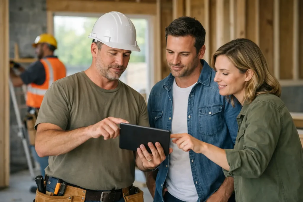
A builder can have solid work, good reviews and years on the tools, then still lose leads because the website gives people too many reasons to leave. It happens fast. A homeowner lands on the site, can’t tell what kind of building work you do, can’t find your service area, and doesn’t see an easy way to call. They’re gone. This website conversion guide for builders is about fixing that.
A lot of builders think the main job of a website is to look professional. That helps, but looks alone don’t bring in enquiries. Your site needs to answer the questions people ask themselves before they make contact. Can this builder do my job? Do they work in my area? Do they seem reliable? How do I get in touch right now?
What a builder website needs to do
Most people visiting a builder’s website are not browsing for fun. They’ve got a project in mind and they want to narrow down their options quickly. That means your website has one job above all else – turn interest into action.
For builders, that action is usually a phone call, quote request, form enquiry or consultation booking. If your website gets traffic but not many leads, the problem is often not visibility alone. It’s conversion.
Conversion is simply what happens when a visitor takes the next step. If they leave without calling, emailing or filling out a form, the site hasn’t done its job.
The homepage should make sense in five seconds
Your homepage is not the place for vague slogans or fluffy wording. People need clarity straight away.
A good builder homepage quickly explains what you do, who you help and where you work. If you specialise in renovations, extensions, custom homes or outdoor structures, say that clearly. If you work in specific local areas, include that where it makes sense. Don’t make people guess.
The top section should also include a clear call to action. Not something weak like “learn more”. If you want enquiries, say “Request a quote” or “Call now”. If you want calls, make the phone number easy to spot on mobile and desktop.
This is where many sites fall over. They try to say too much, or they say nothing useful at all. Simple usually converts better than clever.
A website conversion guide for builders starts with trust
Building work is a high-trust service. People are not booking a quick lawn mow. They’re often spending serious money, letting someone into their home, and making decisions that affect their property for years.
That means trust signals matter more for builders than for many other trades.
Photos of real projects help because they show proof of work, not stock images that look like they came from anywhere. Testimonials matter because people want reassurance from past clients. Licensing, insurance and years of experience can also help, but only if they are presented clearly and without trying too hard.
If you’ve worked on homes similar to the one your visitor owns, show that. If you’ve completed extensions in older suburbs, or new builds in growing areas, mention it. Specific proof beats generic claims every time.
There’s a balance here though. Too much detail can slow people down. You don’t need to write your life story on the homepage. You need enough evidence to make the next step feel safe.
Service pages should match what people search for
Many builder websites make the mistake of stuffing everything onto one page. That creates two problems. First, it’s harder for visitors to find what they need. Second, it weakens your chances of showing up for specific local searches.
If you offer home renovations, extensions, granny flats, patios or custom builds, each service should have its own page. That gives you room to explain the work properly and talk to the right customer.
It also helps conversion because the page feels relevant. Someone looking for a kitchen extension doesn’t want to land on a generic “our services” page with a few vague lines. They want to know whether you handle that kind of job, what the process looks like, and how to get started.
This doesn’t mean every page needs to be long. It needs to be useful. Clear headings, simple wording, real project examples and a visible enquiry option will do more than a wall of text.
Your contact options should be hard to miss
If someone is ready to get in touch, don’t make them hunt for it.
A phone number in the header is a good start. A contact form should be short and easy to use. Name, suburb, phone, email and a quick job description is usually enough. The longer the form, the more likely people are to put it off.
Some builders worry that shorter forms bring in lower-quality leads. Sometimes that’s true, but too much friction can cost you genuine work. It depends on the type of jobs you want. If you focus on larger projects, you might add one or two qualifying questions. Just don’t turn it into paperwork before the first conversation.
Also, tell people what happens next. If they submit a form, when will you reply? If they call, who answers? Small details like this reduce hesitation.
Mobile matters more than most builders think
A lot of your traffic will come from mobile. People are checking websites between jobs, after hours, on the couch, or while comparing a few local businesses at once.
If your mobile site is slow, clunky or hard to read, you’re losing leads before your work even gets a look in.
Buttons should be easy to tap. Text should be readable without zooming in. Images should load quickly. Phone numbers should be clickable. Contact forms should work properly on smaller screens. These sound basic, but plenty of tradie websites still get them wrong.
Speed matters too. If a site takes too long to load, people leave. That doesn’t mean you need a stripped-back website with no visuals. It means your site should be built properly, with conversion in mind from the start.
Good photos win work, but only if they support the page
Builders often have one major advantage over other service businesses – strong visual proof. Before and after shots, progress photos and finished projects can all help sell the job.
But dumping a gallery onto the site isn’t enough.
Your best project photos should support the page they’re on. Renovation photos belong on renovation pages. Outdoor living photos belong where people are reading about patios, decks or alfresco builds. Relevance matters.
It also helps to add a bit of context. A photo with a short note about the suburb, type of work or client brief gives the image more weight. It turns a nice picture into proof that you solve the kind of problem your visitor has.
Reviews and local proof help people choose faster
When homeowners compare builders, they’re looking for risk reduction. Reviews do that.
A few strong testimonials placed in the right spots can lift conversions more than a big block of generic sales copy. It helps if the reviews mention communication, reliability, workmanship and how problems were handled. Those are the things people worry about.
Local proof also makes a difference. If someone in Midland is looking for a builder and sees work completed nearby, that feels more relevant than a broad claim about servicing all of WA. Keep it grounded and believable.
This is one reason local SEO and website conversion work best together. Getting found is step one. Giving people confidence to contact you is step two. One without the other leaves money on the table.
Don’t bury the next step
Every important page on your website should make the next action obvious. That might be calling your mobile, requesting a quote or sending an enquiry.
You don’t need flashy pop-ups or pushy gimmicks. For many builders, that sort of thing does more harm than good. What works better is consistency. A clear button. A visible phone number. A short prompt that tells people what to do next.
The wording matters too. “Get a quote” is stronger than “submit”. “Speak with us about your project” is better than “contact”. Small changes can lift response rates because they sound more human and more relevant.
If your website isn’t converting, check the basics first
Before assuming you need a full rebuild, look at where the site is falling short. Often the biggest problems are simple. The message is unclear. The phone number is hard to find. The service pages are too thin. The site feels outdated. The mobile version is frustrating. Or the traffic coming in isn’t matched to the services you actually want.
A good website conversion guide for builders is not about tricks. It’s about making it easy for the right customer to trust you and take action.
If your site is getting visits but not enquiries, that gap can usually be fixed with clearer messaging, better page structure, stronger proof and a smoother path to contact. That’s the practical side of conversion work, and it’s where good websites start pulling their weight.
For builders, the best website is not the one with the fanciest layout. It’s the one that answers questions fast, shows real proof, and gives people a simple reason to pick up the phone.