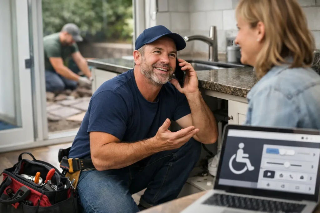
A homeowner with a burst pipe is not going to wrestle with a hard-to-read website. They will tap back, call the next plumber and move on. That is why website accessibility for business matters to tradies. It is not just about ticking a box or making a site look polished. It is about making it easy for more people to find what they need, call you and book the job.
For a local service business, a website has one main job: turn searches into enquiries. If the text is too small, the phone number is hard to tap, the contact form is confusing or the page is slow and cluttered, you are creating friction at the exact moment a customer is ready to act.
What website accessibility means for a tradie business
Website accessibility means your site can be used by as many people as possible, including people with vision, hearing, mobility or cognitive challenges. In practical terms, it means a visitor should be able to understand your services, navigate the site and contact you without unnecessary hassle.
You do not need to become a web expert to see why this affects leads. Some customers use screen readers that read web pages aloud. Others cannot easily use a mouse, have limited vision, struggle with dense blocks of text or are trying to use your website one-handed from a mobile while dealing with an urgent problem.
Good accessibility also tends to improve the experience for everyone else. Clear headings help a rushed customer scan your services. Strong contrast makes text easier to read outside in bright Perth sun. A properly labelled contact form reduces abandoned enquiries. A clear call button saves someone from copying and pasting a number.
The goal is simple: remove obstacles between a local customer and your business.
Where inaccessible websites lose real enquiries
Most accessibility problems are not dramatic. They are small frustrations that add up until a customer leaves. For a plumber, electrician, builder or landscaper, each lost visit could have been a decent job.
A common issue is relying on an image to carry important information. If your emergency number, service areas or special offer is only shown in a graphic, some visitors may not be able to access it properly. The same goes for before-and-after galleries with no useful descriptions. Photos build trust, but the key details still need to appear as normal text on the page.
Another issue is low-contrast text. Light grey writing on a white background might look tidy on a large office screen, but it can be difficult to read on a mobile. If a visitor cannot quickly read that you offer switchboard upgrades, hot water repairs or retaining wall construction, they will not hang around to investigate.
Contact forms can also quietly cost leads. A form with vague fields, error messages that do not explain what is wrong, or tiny checkboxes is frustrating. Keep it short and tell people exactly what you need: name, mobile number, suburb, service required and a brief description of the issue. For urgent work, put a tap-to-call button above the form as well.
Then there is navigation. A menu packed with too many pages, vague labels and pop-ups makes people work harder than they should. Customers do not want to decode your website. They want to know whether you service their area, whether you do the job they need and how to reach you.
The practical fixes that make a difference
Accessibility does not have to mean rebuilding everything from scratch. It depends on the state of your current website. If the site is old, slow and difficult to update, a fresh build may be the sensible option. If the structure is sound, targeted improvements can make a real difference quickly.
Start with the parts of your site that affect enquiries most:
- Make phone numbers large, visible and tappable on every important page.
- Use clear headings that describe the service, such as “Blocked Drain Repairs” rather than “What We Do”.
- Check that text stands out clearly from its background, especially buttons and contact details.
- Add useful descriptions to service images, team photos and project galleries.
- Keep contact forms short, easy to complete and clear about any required fields.
- Make sure every page works properly on a mobile, including menus, quote forms and call buttons.
These are not fancy extras. They are basic lead-generation work. A customer should not need to zoom in, guess where to click or search around for your number.
Plain English matters here too. Avoid vague wording like “complete solutions for all requirements”. Say what you actually do. “We repair leaking taps, burst pipes and blocked drains across the Perth Hills” is easier to understand and gives a customer confidence they have found the right business.
Accessibility and trust go together
People make quick judgements about local service businesses online. If a website is confusing, difficult to read or broken on mobile, customers may assume the business will be difficult to deal with too. It may not be fair, but it happens.
On the other hand, a clear website sends useful signals. It shows you are organised, easy to contact and focused on helping customers solve a problem. That matters when a homeowner is comparing a few local businesses after hours or between appointments.
Accessibility also supports the trust-building details that influence enquiries. Reviews should be easy to read. Service areas should be stated plainly. Licences, insurance and relevant qualifications should not be buried in a hard-to-find footer. If you offer emergency work, make the response process clear. Tell customers whether they should call, what hours you answer the phone and what information will help you get moving.
The best tradie websites do not make visitors think too hard. They answer the questions that stop someone from calling.
Website accessibility for business is not a one-off job
A website can become less accessible over time. New photos get added without descriptions. A plugin update changes the way a form works. Someone adds a coloured banner that is hard to read. New service pages use different layouts and the call button disappears.
That is why it is worth checking the site whenever you make changes, especially before a busy season or after adding a new service. Test it like a customer would. Use your own mobile. Try to find a particular service, check whether you cover a suburb and send an enquiry without help. Ask someone else to do the same and watch where they get stuck.
You should also check the basics from a keyboard, rather than only with a mouse. Can you move through the menu and form fields in a logical order? Can you see where you are on the page? If not, some visitors will have the same problem.
Legal accessibility requirements can vary depending on your business and the type of website you operate, so it is sensible to get appropriate advice if you are unsure. But waiting for a compliance issue is the wrong reason to improve the site. The immediate business case is easier: a site that more people can use gives you fewer missed opportunities.
A better website should make the next step obvious
There is a balance to strike. Your site does not need to be stripped back until it has no personality. Good project photos, local proof and clear branding all help. But design should never get in the way of a customer taking action.
For most local service businesses, the next step should be obvious within seconds: call now, request a quote or send an enquiry. Put that action where people can see it, explain what happens next and make the process work properly on mobile.
If your website looks fine but is not producing enough calls, accessibility is one of the first things worth checking. Small fixes can stop good leads slipping away. Yazoogle helps Perth tradies identify the parts of a website that are getting in the way and fixes them with one goal in mind: make it easier for local customers to get in touch and book the work.