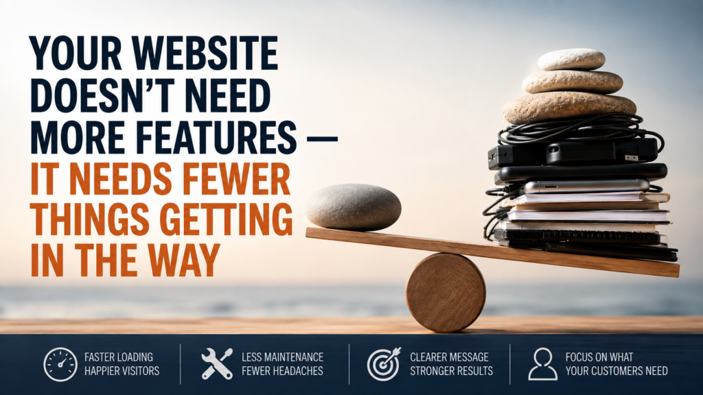
Why Your Website Doesn’t Need More Features — It Needs Fewer Things Getting in the Way
Business websites tend to accumulate features such as website creep in the same way offices accumulate equipment. A slider is added because it looks modern. A pop-up appears because somebody says the mailing list needs more subscribers. A live-chat widget is installed, then an animation library, a social feed, a booking integration, a review carousel and several tracking scripts. Each addition can be justified individually. The problem becomes visible only when nobody stops to ask what the combined system is actually doing for the person who arrived at the website with a simple question.
That person may want to know whether you provide a particular service, whether you work in their area, what a product costs, whether you can solve the problem they have, or how to contact you. They are not evaluating the technical sophistication of the website. They are trying to move from uncertainty to an answer. Anything that helps that movement has value. Anything that delays it, distracts from it or creates another obstacle deserves much more scrutiny than most websites give it.
This is where feature-heavy websites can become deceptive. They often look more capable from the business owner’s side because there are more visible components, more options in the dashboard and more things happening on screen. From the customer’s side, however, those same additions may mean slower loading, shifting layouts, interruptions, more choices, more visual competition and less certainty about what to do next. A useful website is not the one with the longest feature list. It is the one that removes the most friction between a customer’s intention and the next useful action.
Every Feature Creates a Cost, Even When You Cannot See It
A website feature rarely arrives alone. A slider may require extra JavaScript, styling files, images and controls. A pop-up may add its own scripts, cookies, targeting rules and administration interface. A page builder can introduce an entire layer of markup and styling between the content and the browser. A plugin may depend on other plugins, external services or scheduled updates. None of these things is automatically bad, but every one of them increases the number of moving parts involved in producing what the visitor eventually sees.
The important distinction is between visible value and invisible cost. The visible value is easy to explain: the animation looks polished, the gallery displays more photographs, the chat widget offers another contact option. The invisible cost is distributed across performance, maintenance and complexity. More code has to load. More components have to remain compatible. More software may need updating. More potential failure points appear. The website owner may not notice those costs until the site becomes slow, an update creates a conflict or a formerly simple task requires someone with specialist knowledge to repair it.
This is why feature decisions should not be made by asking whether something is attractive, popular or technically possible. The better question is whether the feature earns the complexity it introduces. A useful feature creates enough customer value to justify its additional weight. A decorative feature that adds almost nothing to the visitor’s ability to understand, decide or act is far harder to defend.
The rule is simple: every feature should earn its place by helping the customer move forward.
The Customer Is Trying to Complete a Journey, Not Admire a System
Business owners naturally see their websites differently from customers because they know too much. They know where the contact page is, what the company does, why a particular service matters and what every piece of terminology means. A first-time visitor has none of that context. The visitor may have arrived after searching for a very specific problem and may be deciding within moments whether this is the right business to investigate further.
Imagine a homeowner looking for someone to replace an ageing hot-water system. The website opens with a full-screen video. A promotional pop-up covers part of the page. The navigation contains ten options. A rotating banner changes from hot water to bathroom renovations before the visitor finishes reading it. A chat bubble covers part of the mobile screen, while an animated review widget slides into view from the bottom. Every element may have been installed with good intentions, yet together they have made the visitor work harder to answer a basic question: can this business help with my hot-water problem?
Now imagine the same customer opening a simpler site. The page loads quickly. The heading immediately identifies the service. A short explanation describes the common problems the business handles. The service area is clear. A prominent phone or enquiry option appears where the visitor expects it. There may be fewer features, but there is more useful communication. The simpler website is not doing less in any meaningful customer sense. It is doing less technically so the customer can accomplish more easily.
This distinction matters because website effectiveness is often confused with website activity. Movement on a screen can feel energetic, but activity is not the same as progress. A customer’s progress is measured by how easily they can recognise relevance, understand the offer, build enough confidence and take the next step.
More Choice Can Create Less Clarity
Features do not only add technical weight. They also compete for attention. A visitor who sees three calls to action, four promotional panels, a newsletter invitation, a chat prompt and a row of social icons is being asked to make decisions before the business has necessarily answered the reason they came to the site.
This creates a hierarchy problem. Every good page should make some information more important than other information. The primary service message should usually be easier to notice than secondary offers. The main next step should normally be more obvious than optional activities. When too many components demand equal attention, the website loses its ability to guide the visitor. Everything becomes visible, but nothing feels clearly important.
A useful mental model is to think of attention as a limited budget. Each visual element spends some of it. Large animations spend more. Pop-ups spend a great deal because they interrupt the existing task. Multiple coloured buttons divide attention between competing actions. Auto-playing media may demand attention whether the visitor wants to give it or not. If a feature consumes significant attention but does little to help the customer decide or act, it is an expensive feature even if it costs nothing to install.
This does not mean that every website should be visually plain or stripped of personality. Good design can direct attention beautifully. Images can explain, reassure or establish quality. Interactive tools can solve genuine customer problems. The issue is not whether a website contains sophisticated features. The issue is whether those features strengthen the customer’s path or merely decorate it.
Optimisation Cannot Always Fix an Overcomplicated Website
When a website becomes slow, the instinct is often to add another solution. A caching plugin is installed. An image optimisation service is connected. Another performance tool combines files or delays scripts. These measures can be useful, but they can also produce an odd cycle in which additional technology is introduced to compensate for the weight created by existing technology.
At some point, optimisation becomes an attempt to manage complexity rather than remove it. A website may contain a heavy page builder because it provides hundreds of design capabilities, even though the business uses only a small number of them. Several plugins may remain active because they each provide one minor feature. External scripts may continue loading on every page despite being useful only in particular circumstances. The resulting system can be carefully tuned, but it is still carrying more machinery than the customer’s task requires.
This is where simpler HTML-based websites can have a structural advantage for businesses with straightforward needs. If a site primarily needs to explain services, display examples, answer common questions and generate enquiries, it may not require a large software environment simply to present those pages. Clean HTML, CSS and carefully chosen JavaScript can provide a polished experience without loading an extensive collection of functions the visitor never uses.
The lesson is not that HTML is automatically superior or that content management systems are inherently inefficient. Businesses that publish frequently, manage large product catalogues, require complex member functionality or rely on integrations may have good reasons for using more sophisticated platforms. The useful distinction is proportionality: the technology should be appropriate to the job. A five-page service website and a large ecommerce operation do not need the same underlying machinery simply because both are called websites.
Maintenance Is Part of the Feature Decision
Features also create obligations after launch. A plugin that works perfectly today may eventually need an update. A third-party service can change. A theme update may affect styling. An integration may stop communicating with another system. A page builder can introduce new versions or deprecate older components. Again, none of these possibilities makes the technology unsuitable, but they belong in the original decision about whether the feature is worth having.
Business owners often evaluate a new feature at the moment of installation, when the benefit is most visible and the future maintenance burden is least visible. A better evaluation looks at the entire life of the feature. Will somebody need to configure it? Does it introduce security or compatibility dependencies? What happens if the provider changes its service? Will the business know if it stops working? Is the feature important enough to justify that ongoing responsibility?
A static or relatively simple HTML website can reduce some of these dependencies because there may be fewer software layers requiring continual attention. That does not mean it requires no maintenance at all. Content still needs to remain accurate, forms and external services still need checking, and hosting environments still matter. The advantage is that fewer moving parts can make the system easier to understand, test and keep stable.
This is especially valuable for businesses whose websites are not meant to be software products. A plumber, consultant, manufacturer, trades business or professional service firm may primarily need a reliable digital front door. If the website’s main purpose is to explain, reassure and generate contact, stability can be more valuable than having dozens of capabilities available in an administration panel.
Give Every Feature a Customer Job
The most practical way to prevent feature creep is to require every proposed addition to have a clearly defined customer job. “It looks better” is not enough. “Other websites have one” is not enough. “The plugin has excellent reviews” is not enough. The feature should solve a specific problem or improve a specific stage of the visitor’s journey.
Before adding or keeping a feature, ask a short set of questions:
- What customer problem does this feature solve?
- At what point in the customer’s journey is it useful?
- Does it make the next step clearer, faster or easier?
- What does it add in loading, maintenance or distraction?
- If we removed it tomorrow, would customers genuinely lose something important?
These questions make decisions surprisingly clear. A pool-paint calculator that tells a customer how many kits they need has an obvious job. It reduces uncertainty that might otherwise prevent a purchase. A booking system that lets customers choose an available appointment without calling may also earn its place. An image gallery showing the quality and type of completed work can help customers evaluate suitability. These are features tied to recognisable customer tasks.
A rotating banner that hides one important message to display another may have a weaker case. So might an animated counter showing how many years the company has existed, a decorative background video or a newsletter pop-up shown to somebody who has been on the site for five seconds. Those elements are not forbidden. They simply need to pass the same test as everything else. If the customer benefit is vague while the cost in attention, loading or maintenance is real, removal may be the better improvement.
The Best Website May Feel Simpler Because the Thinking Was Better
Simplicity is sometimes mistaken for a lack of ambition. In reality, a website that feels effortless to use often reflects more disciplined decisions than one filled with visible features. Someone has decided what matters most, what can be removed, which actions deserve emphasis and which technologies are genuinely necessary. The result can look simple precisely because the complexity has been handled before it reaches the customer.
That is the standard worth aiming for. Do not measure a website by how many things it can do in theory. Measure it by how easily the right customer can do the few things that matter in practice. A website should help people recognise that they are in the right place, understand what the business offers, gain enough confidence to continue and complete the next useful action with as little unnecessary friction as possible.
The next time somebody proposes a slider, pop-up, animation, plugin, integration or clever new widget, do not begin by asking whether it can be added. Ask the question that protects both the customer experience and the website itself: what becomes easier for the visitor because this feature exists?
If there is no convincing answer, the strongest improvement may be leaving it out.
Your Bonus — Use This AI Prompt To Get More Ideas
Copy the prompt below, open your preferred AI tool, paste it in and replace the example information with your own details. Use the result to get more ideas and apply what this article just taught you.
Need Help With “Your Website Doesn’t Need More Features — It Needs Fewer Things Getting in the Way”?
Knowing what needs fixing is one thing. Getting it fixed properly is another. If you’d rather have an experienced digital marketer help you work through the problem and turn the advice into action, Yazoogle is here to help.
Get Help From Yazoogle